yiannispapadopoulos

Kingston University London Logo

Not registered yet?

Click here to register now.

Login

Login/Register
  • Sample Page

yiannispapadopoulos

Monotype – Pencil to Pixel

(posted by Yiannis Papadopoulos on November 20, 2012)

This is the name of the exhibition that takes place in Metropolitan Wharf  till next Friday (23/11) and reveals to the public, rarely seen before treasures of monotype craftmanship.

This is how the exhibition introduces itself.

Here are some of the presented artifacts

Albertina, by Chris Brand  1961

Centaur Italic (Arrighi) by Frederic Warde, Circa 1929

Gill Sans Ultra Bold (Sans Elefans) by Eric Gill, 1933

Pastonchi by Eduardo Cotti and Francesco Pastonchi, 1927

Centaur by Bruce Rogers, 1914

Perpetua Italic, by Eric Gill, 1928 – 1933

9pt. Monotype Times New Roman 1931

Neue Helvetica photographic masters cut in Rubylith, 1983


Photographic matrices for the Linofilm Europa, 1970

Typical brass matrices for a Linotype hot-metal caster

Typical brass matrices and matrix case for a Monotype hot-metal caster


Brass pattern plate for Linotype Alte-Schwabacher

Copper Pattern plate for 6½pt. Monotype Peninim (Hebrew)

Aerial view of the Monotype Works, circa 1973

Photograph of the Monotype Works in Salfords, Surrey, circa 1923

Silver Trowel used to lay the first brick for the Monotype Works, 3 July 1899

 Monotype Newsletter 27, 1936

Monotype Newsletter 52, 1957

Brochure for “Monotype” Photolettering Machine Mark 2, 1969


The artwork produced for the Times, takes a special place in the exhibition

Here are some pictures of the place where the exhibition is carried out, place which contributes substantially into making “pencil to pixel” a unique experience.


 Visiting “Pencil to Pixel” is absolutely recommended! It establishes a certain way of viewing the monotype craftmanship, a more respectful one.


11/12: colours workshop

(posted by Yiannis Papadopoulos on November 13, 2012)

Today was the second workshop we had, and it was about colours. Everyone had prepared eighty four paper squares painted in different colours from the list we were given.

The first thing we did was to spread them on the tables in front of us and mix them.


Then we tried to make groups of the same colours. Within these groups the colours were also organised from the darker to the lighter.


The next step was to transfer these squares to the wall, and display them in a meaningful way, that has to do with qualities of colours such as hue, saturation and tone. In our group we followed a horizontal arrangement similar to that of the rainbow (red, orange, yellow, green, blue and purple) expanding it upwards with lighter tones and downwards with the darker ones. Here is a short video of the whole procedure .

And this is the way the Group 2, of Gr.Designers, dealt with the issue.

As it was mentioned in the workshop, the qualities of the colours seem to impose a certain kind of order and meaning to a composition.

The feeling i get from the second composition is more random and organic. Strong saturation is mixed with the poor one and darker hues are mixed with the lighter ones in an unexpected but not meaningless way. Also in terms of movement, I’d say that I get the feeling of a round one, something like a vortex …

While in the first case, the things are more structured since on the base the are the dark hues, in the middle the strong saturation and on the top the light hues. I’d say additionally that i get the feeling of a wave that starts from one edge of the wall, moving towards the other.


the 5/11 session: the plastic number

(posted by Yiannis Papadopoulos on November 7, 2012)

Before start talking about the plastic number I’d like to mention to last session’s highlight: the beautiful handmade things a classmate (so sorry I haven’t written down her name)  shared with us. So much hard work!

My shots were close ups, I didn’t want to catch the whole shape. I somehow liked the feeling of being trapped in them, as if they were a kind of pattern environment …

Moreover, during my presentation I was suggested to take a look at the work of the Dutch architect (and monk) Dom Hans van der Laan (1904 – 1991) who in a few words tried to adjust the golden section (number φ) rule to the three dimensional world producing the number ψ=1.324…., named also “the plastic number” or in a mathematical way of speaking the only real solution of the equation x³=x+1.

On a philosophical level, according Dom Hans van der Laan, this number could be used to establish a kind of harmony among three elements, nature,human beings, and human creations that should always respect the previous two elements.http://fr.wikipedia.org/wiki/Hans_van_der_Laan

 According to Dom Hans van der Laan the respective dimensions of the two objects are perceptible, when the larger dimension of the one is equal to the sum of the two smaller dimensions of the other.http://fr.wikipedia.org/wiki/Hans_van_der_Laan

“The mutual proportion of three-dimensional things first becomes perceptible when the largest dimension of one thing equals the sum of the two smaller dimensions of the other”http://www.emis.de/journals/NNJ/conferences/N2002-Padovan.html

“Proportion plays a curcial role in generating architectonic space, which comes into being through the proportional relations of the solid forms that delimit it. Architectonic space might therefore be described as a proportion between proportions.“http://www.emis.de/journals/NNJ/conferences/N2002-Padovan.html

This might be a way to translate what Dom Hans van der Laan meant when he said that the human creation should respect the other two elements, human being and nature.

I’ll try to apply the “plastic number” in the design of my Chinese boxes, the possibility of applying such a rule in my design, is something I hadn’t thought before, I think it is exciting!

To my surprise, searching a little bit more on Dom Hans van der Laan I found that his work applies to graphic design itself to the point where a typeface has been created applying his theory of proportions. The following video http://www.behance.net/gallery/Digital-Alphabet-in-Stone/2598457  is absolutely illuminating !


Visual literacy: the square / the Chinese Box

(posted by Yiannis Papadopoulos on November 5, 2012)

Deciding what will be the cultural context which will encompass the shape I work with (square), wasn’t a difficult thing to do. During the first phase (visual grammar) I had already the feeling that the cube I came up with, was a Chinese box.

Now that was the perfect start for me. to put this shape in a certain cultural context. Moreover the special nature of Chinese language, where the meanings of words are formed in a different way than that in the west, offers a new perspective to shape and its interpretations.

3) The square, on the other hand, with its straight lines and sharp corners, represent laws and regulations. It’s worth mentioning that the concept of a “square” in China is quite different from that in other countries. In English (and I suspect it’s the same case in other Latin-based languages) a “square” is a shape with all four sides of the same length, and similar shapes with sides of varied lengths are called “rectangles”. In Chinese, all of those shapes are part of the same family, “方” (fāng). Under that, squares are “正方” (zhèng fāng, “perfect square”) and rectangles “长方” (cháng fāng “stretched square”). Therefore, when talking about “squares” in the context of Chinese culture, I mean all four-sided shapes with four right angles, regardless of height-length ratios. http://www.illuminantpartners.com/2012/04/23/more-than-just-a-circle-and-squareshapes-chinese-culture/

Chinese: 没有规矩,不成方圆 méi yǒu guī jǔ, bù chéng fāng yuán English: You can’t get a perfect square or circle without the use of compasses and rulers. (One can’t achieve greatness without following rules and laws.)

Chinese: 这不失为一种好的方法 zhè bù shī wéi yì zhǒng hǎo de fāng fǎ English: This is a good method. Usage: “方法” (fāng fǎ), “way of the square”, noun. It originally meant the way to measure the size of a square or a rectangle. In modern Chinese, it’s been extended to mean “ways of doing things”.

Chinese: 做人应当品行方正 zòu rén yīng dāng pǐn xíng fāng zhèng English: One should live with flawless morality. Usage: “方正” (fāng zhèng), “square and straight”, adjective. It took on the meaning that “someone’s morality is like a square, with perfect straight lines and right angles”.

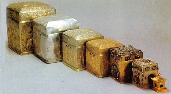
Chinese box: Set of boxes of Graduated sizes. The larger box contains the smaller one. Also called Nested box. The Chinese crafted nesting boxes that date back to the Song Dynasty, around 1000 AD.  These boxes were both functional and decorative

NestingCaskets

Its a traditional style in Chinese design. The idea of nested boxes or squares is very popular in traditional Chinese design. Here are some examples


Nested boxes have passed the boundaries of East and have become popular packaging solutions in West.

These are some examples of how the idea of Nested boxes is employed today  http://weburbanist.com/2008/12/03/shelves-cabinets-drawers-creative-storage/

Chinese boxes can also work as figurative description or metaphor or symbol or illustrative example for situations of

Conceptually nested arrangements or Conceptually recursive arrangements.

But what does it really mean? Well arrangements, can be formations and groupings of elements. The fact that they are recursive gives us an extra clue about these elements: they repeat themselves in a self similar way to construct these formations. And even more the fact that they are nested implies, that they fit, the one into the other. So the arrangements produced are not random but they rather have a certain kind of order ,structure, hierarchy or symmetry . All these in a conceptual level. give a kind of philosophical dimension to these arrangements / or situations.

Examples

In literature: a Chinese box means narration within a narration, or stories planted within stories, as in the case of flashback within a flashback.

examples: Mary’s Shelley “Frankenstein”  at one point features the narration of an Arctic explorer, who records the narration of Victor Frankenstein, who recounts the narration of his creation, who narrates the story of a cabin dwelling family he secretly observes and a more recent one is The story “The Three Brothers” was in Harry Potter and the Deathly Hallows and its film adaptation

In cinema: Some examples are, The French Lieutenant’s wife 1980, written by Harold Pinter, The Bad Education 2004 by Pedro Almodovar, Adaptation 2002 directed by S.Jonzie and written by Charlie Caufman, and Inception 2010 by Christopher Nolan and many others.

In mathematics: the idea of Chinese boxes and their recursive attribute can be illustrated by the Fibonacci sequence, (a sequence where each part is the sum of the two previous ones) also common to design itself when considering proportions due to its pattern making ability. The universal application of this sequence, from the shape of galaxy to the shape of our ear, gives a whole new, astonishing dimension to the idea of recursion.

Also, what makes it, even more appealing to me, is that, as the following video: “Fibonacci numbers-the fingerprint of God”, implies, this sequence and its infinite spiral pattern depiction, could be perceived as a code, as a design for the whole universe.

The idea of recursion is also applied in mathematics when it comes to fractals which “are typically self-similar patterns, where self-similar means they are “the same from near as from far”

In visual arts, the idea of recursion is illustrated by what we call the Droste effect or “mise en abyme” in french or strange loop.
Droste effect is named after the illustration on the packaging of a cocoa powder Dutch brand.

where the image is repeating itself, within itself, on a smaller scale each time. Here are some examples of Droste effect.

the CD cover for the Pink Floyd album “Ummaguna” released in 1969.

Droste Effect with the use of digital media

Droste effect in Escher

 “Mise en abyme” means placed in the abyss, and the term is used to describe the phenomenon of an object placed between two mirrors, which reproduce an infinite number of its reflection. The word “abyss” is eloquently used to give this feeling of the fathomless tunnel that is created through these countless reflections.

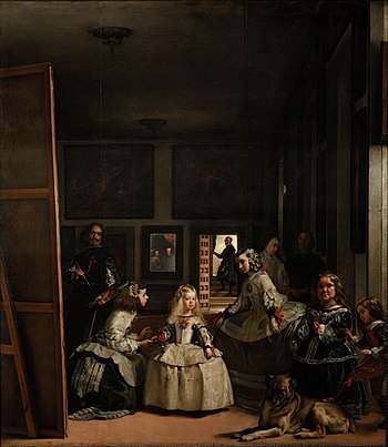
Maybe, the most famous example of “mise en abyme” in art history, is “Las Meninas” of Diego Velaquez.

Another quite illustrative example of “mise en abyme” is given in Christopher Nolan’s Inception, which itself works as a Chinese box (the dream within the dream)

According to Wikipedia, the Droste effect is a case of Strange Loop. What is a strange loop? the best way to define it, is through a series of examples.

Once more I’ll use as reference C.Nolan’s Inception,

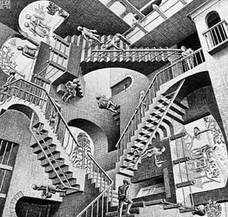
The paradox of an infinite staircase, also known as the Penrose steps is a case of Strange Loop, which we can also meet in the works of Eshcer

                                                File:Escher's Relativity.jpgFile:DrawingHands.jpg

All these examples are called Paradoxes simply because we live in a three dimensional space. (with the fourth dimension, time, being invisible). So if we move from these topological dimension to a fractal dimension, the paradox, does no longer exist.

Overall, I found absolutely fascinating this “journey” that started due to the Chinese boxes.  Thanks to them we’ve had the chance to encounter meanings such as the conceptual nested arrangements, conceptually recursive arrangements, Recursion, the narrative within the narrative, the Fibonacci Sequence, the Droste Effect, the Mise en Abyme, the Penrose Paradox, the Strange Loops and the Fractals.

Moreover, ideas such as recursion, infinite and paradox, pattern seem to me, intriguing both as a human and as designer.


Me & a square (project 1/ visual grammar) Update

(posted by Yiannis Papadopoulos on November 3, 2012)

This was my first attempt to go on, thinking on square as a shape. I used the Pythagorean tesselation to produce the following collage. The tesselation gives a sense of order and structure. which I tried to question, being inspired by the Rothko’s “soft” multiforms. I used water colours, which no matter how hard you try, they don’t give you  border lines sharp enough . Also I used packaging paper,tissue paper, leaves, transparent paper of different qualities, one from the draw material shop, the other used to stuff shoe boxes.

What I tried for the first time, was to bring the materials closer, by deepening them into water with acrylic, trying to dye them, somehow.

I had also in mind, to cut the whole collage into equal squares, and stick them into a flat surface made out of squares arranged in groups of square also formations. But I wasn’t really pleased with that idea. The flat thing, made it boring for me.

Then I visited the Charles Eaemes exhibition, his toy cards, which could be used to make various constructions, seemed to me so strange, that I felt instantly captured by them. So I thought that since   i had already squares  made out of cardboard in my project, they could be used as materials to construct things avoiding the flatness that bothered me in the first place.

Thus, I thought of building a box with these cards, a cubicle one, which would open revealing an attached “book”. Its pages would be my square cards, in groups of three, unfolding and folding in order to fit in the cube when it is closed.

The next step was to cover each square with thoughts, ideas or experiments concerning square itself. For the four squares that would be the “walls” of the box, I was going to “describe” their surface with lines, produced out of the following cuttings.

For the rest that would be the pages of the book I was going to use my first collage as well as the Pethagorean tesselation and the Pythagorean fractal that I had found in the meantime that it could give me similar results of order, structure and segmentation. Here are the cuttings that I would have used.


However, before applying the above cuttings, I thought I could try using their leftovers, just as it was mentioned in the workshop a few days ago. Actually what I tried to do was to organize these pieces through movement, in three part narrations.

With the notion of narration came together the idea of giving a title to each of them. So the left one is named “let it be square” and the right one “explosion”.

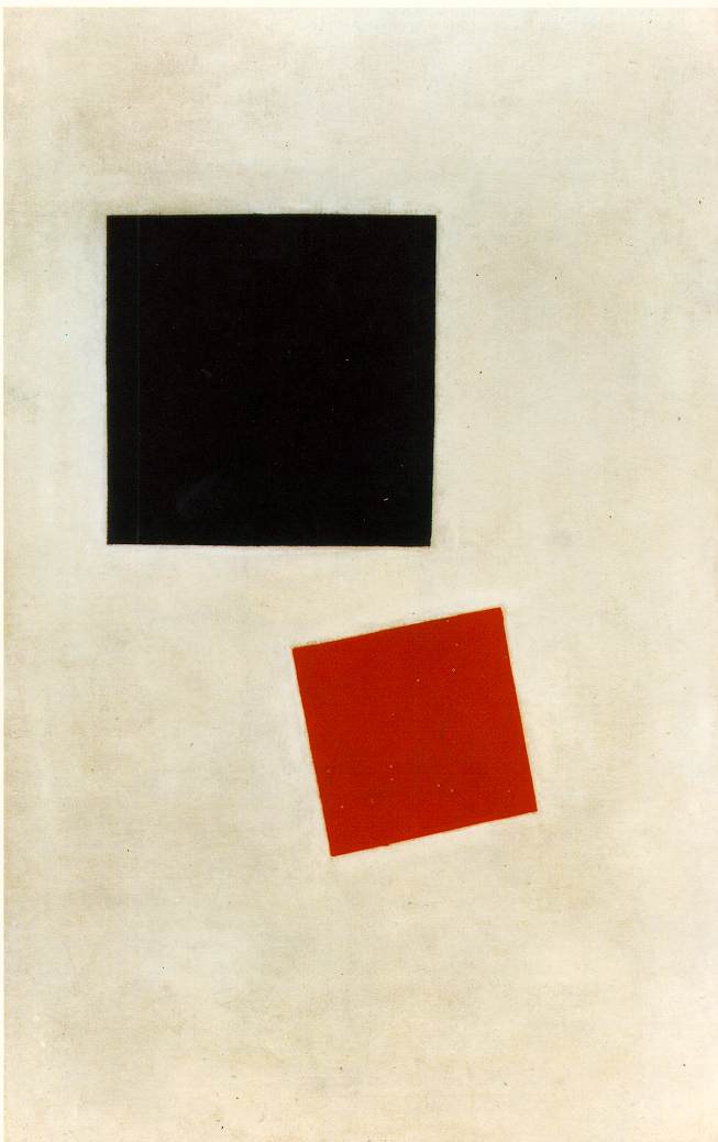
Here the left narration is titled “I don’t want you any more”, while the right one ” I need a place to fit in”.  The use of the black square gave me the chance to create a link between the three first narrations and the forth where the collage I made in the first place is introduced. I need to say that inspiration for the left triple was the “Black square- red square” by the Russian artist Kasimir Malevich .

The titles given to the narration gave me positive feedback from the tutors and the colleagues. I think that making the square a character, made instantly easier for them to identify with what happened to the narration, in some cases they even laughed!

What I really needed in this project, was to use better materials, the final stage of it would have looked better. But the whole thing was developing constantly, I hadn’t an exact idea from the beginning where I was heading for.

Trees of words

(posted by Yiannis Papadopoulos on November 2, 2012)

“If a seperate personal Paradise exists for each of us mine must irreparably be planted with trees of words which the wind silvers like poplars, by people who see their confiscated justice given back, and by birds that even in the midst of the truth of death insist on singing in Greek and saying, eros, eros, eros.”

This is a quote of the Noble prized poet Odysseas Elytis, He mentions “trees of words, ” isn’t that such a designful / meaningful idea?

Bruno Munari & the useless machines

(posted by Yiannis Papadopoulos on November 2, 2012)

Last Saturday I managed to visit the Estorick Collection in North London, and the exhibition devoted to Bruno Munari (Milan 1907-1998)

Who is Bruno Munari? I had no idea, I didn’t know what to expect. Finally the feeling I got was more than rewarding, strong enthusiasm and the impression of something completely fresh, that became more important when realizing that the artifacts exposed where produced more than sixty years ago (from his early years – Futurist phase* to the post war period.)

*In 1925 Munari returned to Milan – the place where he was born eighteen years earlier – and almost immediately joined F.T. Marinetti’s Futurist movement. Futurism was one of the most active driving artistic forces in Italy at the time; it celebrated speed, technology and other aspects of modern life. Munari was fascinated by Futurism’s ability to experiment with new media and to mix different art forms and techniques, as well as by its strong links with the cultural industry (design, advertisement, graphics, architecture).  http://onestoparts.com/listing-bruno-munari-estorick-collection

Water colours, temperas, acrylics, graphic design, abstract compositions, photomontages, printings, mixed media, posters, objects, the famous “useless machines”, installations (coming from a period when I am not sure if the term was used the way it is today in art), all were there to compose the multilevel and ever researching personality of an iconic figure for art, Futurism, graphic and industrial design.

A special mention has to be made to his useless machines. ” In 1930 he began designing his Useless Machines – the first “mobiles” in the history of Italian art – creating a distinction between his personal aesthetic and that of orthodox Futurism, with its fascination for roaring machinery and its uncritical attitude forwards progress” (From exhibition’s catalog)

That’s what Munari had said himself about his machines “Objects to look at in the way you look at a drifting group of clouds having spent seven hours inside a factory full of useful machines”.

His 1946 first spatial environment entitled Concave-convex gives beautifully that “cloud quality” 

The following Useless Machine (1947) is my favorite.

Those four rectangular sticks, with the colourful edges, hang from the ceiling and one from the other in perfect balance. They stay always parallel to the ground, while they rotate smoothly in random orbits, with the slightest movement of the air, as if there is no gravity.  Not to mention their shadows, which for me, is a whole different narrative, like a different piece of work. Pay attention to the edges of the shadows, one sharper, the other more blur, as if it is vibrating.

Overall, I find this “machine” “pure” like music and refreshing for the mind.

The title of the exhibition is one of the artist’s own statements, that he owed his art to his “Futurist Past”.  The irony and the playfulness of this paradox, are so indicative of Munari’s work.

Paradox like that of the “Useless Machines”, when he wanted to “mock Futurism’s fascination with roaring machinery and its uncritical attitude towards progress: these “machines” are useless as they do not produce any tangible goods, nor do they cut down the costs of labour; they are simply objects to look at.” http://onestoparts.com/listing-bruno-munari-estorick-collection

And playful like a child’s game


Saturday with the Eames

(posted by Yiannis Papadopoulos on October 22, 2012)

Saturday morning, and I am off to Pitzhanger Manor-House in Ealing where is hosted the exhibition “Addressing the Need: The graphic design of the Eames Office”

No long queues this time,(the rain room queue experience is enough for a lifetime), everything is calm in this “humble” manor that looks perfect choice, to let the exhibition tell you the Charles Eames story.

The whole project is completely inspirational, I left having learned new things about this iconic designer but most importantly eager to learn even more.

One of the things that was made clear, was that all this amazing design production (furniture, toys, exhibitions, films, graphic material) is the result of the collective work of Charles Eames, his wife’s Ray and their team’s (the Eames Office /a “fairyland” or an “endless education institution” ). This fact portrays for me, in the best way, that design is the product of a collaborative process.

One of the aspects of the Eames’s creative activity I ignored was the film production. One of the most important pieces of this work is the ,  (1977) that in 1998 was selected for preservation in the United States National Film Registry by the Library of Congress as being “culturally, historically, or aesthetically significant”.

The same thing happened with their work on exhibitions, I have never heard before. Their 1964 project “Mathematica” is still running in New York. 

Actually the Eames’s Lounge Chair was the only piece of their production I was aware of. From the guide of the exhibition: ” When asked what Charles’ s and her goal was with the design of the Eames Lounge Chair, Ray Eames answered by putting her hands together snugly, “One hand fits in the other”. Demetrios elaborates, “I always think that she meant both the relation of the wood to the leather and the sitter to the chair – snugly and inevitably together to comfort.” 

But most of all I feel attracted by Charles Eames’s views: Design that addresses the needs, Design affordable and mass produced, Design as an iterative process or a repeating process to achieve the desirable result. “The Eameses firmly believed in the iterative process: as the good hosts that they were, they strove to better each of their designs for their guests.” (from the guide of the exhibition).

A rainy Friday in the RAIN ROOM

(posted by Yiannis Papadopoulos on October 20, 2012)

Yesterday I managed to visit “Rain Room”, the Random International art studio interactive installation, in Barbican’s The Curve. This is going to be a description of the Room as well as a  list of my impressions and feelings.

It took me more than one hour and a half in the queue, to get in the room. As I was approaching the space got darker and darker, evoking a sentiment of awe and mystery. The “Room” is installed in a strange place which is cylindrical on one side and flat on the other.

When we talk about a room, a rectangular space comes in mind, like a box. In this case, only the roof and the floor of room are made out of solid materials, the four other sides that surround us, are formed by the water, that is constantly falling down from numerous points on the roof, and is drained out through the floor.  Outside the Rain Room, a strong spotlight sends light through it.

The installation is interactive, because walking slowly into the Room,  the rain stops pouring down in a small area around you, so you don’t get wet, while it goes on raining outside this area. But if suddenly you start running, the rain starts falling down again. So the speed of your motion affects the rain and creates dry and rainy spaces / columns within the Rain Room itself. In other words, the Room senses your presence, and reacts in it under certain conditions. It ignores you when you don’t respect its rules.

Rain Room is unlike anything I’ve seen in my life before. I can’t say I loved it or that I hated, but I can say I was addicted to it. I didn’t want to get out of it. Actually for me, that powerful source of light, was completely mesmerising, as if it was calling me close to it. Moving towards it, I concentrated my look on the falling water. It gave me the sense of slim,vertical running lines made out of light, or extra thin neon lights going on and off, as the water run down. And when it fell on the ground it created an effect similar to that of the pearls of a necklace, that scatter on the ground, hip hopping hear and there in random oval orbits.

When I turned my back to the light source,the people in the room were not anymore dark shadows, but I could see the colours and the shapes on them clearly. The whole environment became more “friendly” but also less interesting for me. Furthermore  the rain drops weren’t any more bright, they were more transparent and in some cases even like crystals that let the light penetrate them revealing the rainbow colours.

Overall the whole project was exciting, completely fresh and unique. It evoked me the need to test it and explore that new “intelligent” environment of “wet light”. The spotlight through the water in that dark space, gave me a strong impression of colour grey and I felt afterwards that I’ve taken part in a black and white film.

What I found absolutely funny, was the young children. They were more willing than the adults to get soaked to the skin, running through rain. They just couldn’t help dashing from one corner of the room to the other, stopping and beginning suddenly, just as if they wanted to test the Room, and if possible chit it. By the way, the Room, worked perfectly !!!

Q&A WITH RANDOM INTERNATIONAL (the Barbican guide)


“The Nature of Research” by Bruce Archer

(posted by Yiannis Papadopoulos on October 16, 2012)

http://archive.org/stream/TheNatureOfResearch/Archer1995Codesign#page/n0/mode/2up

This is the Bruce Archer article, Paul Mickelthwaite mentioned earlier today during his lecture,

you might find it helpful.

< older news
more recent news >

Recent Posts

  • the workshop 28 1 2013
  • the finale
  • before the assessment
  • Producing a text for the exhibition
  • three more experiments

Recent Comments

    Archives

    • February 2013
    • January 2013
    • December 2012
    • November 2012
    • October 2012

    Categories

    • Uncategorized

    Meta

    • Register
    • Log in
    • Entries RSS
    • Comments RSS
    • WordPress.org
    The Design School
    Skip to toolbar
      • WordPress.org
      • Documentation
      • Support Forums
      • feedback
    • Log in
    • Register